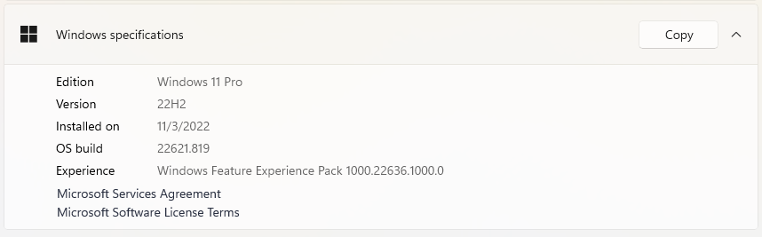
So the latest Windows 11 update – 22H2 – got rolled out to my desktop PC recently and I’ve finally had a chance to try it out and form an opinion on it.
To me, this update feels like what Windows 11 should have been from the start. It fixes a lot of little issues that I almost can’t believe were left in to a production OS, as well as finally giving us some features we’ve wanted for a long time.
Drag & Drop on the Taskbar
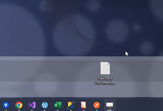
This is something I couldn’t believe was left out of the initial release of Windows 11. For as long as there’s been a taskbar, you could drag things (e.g., files) onto an application’s icon in the taskbar and it would open that app’s window so you could drop the thing you were holding on to it.
However, when Windows 11 first came out, this was not possible – you couldn’t drag anything onto the taskbar except programs to create shortcuts. Dragging and hovering over a running app did nothing.
The only way to drag & drop something was to start dragging and then use ALT+TAB or some other keyboard shortcut to bring the desired app to the foreground so you could drop on to it.
This was a huge annoyance to me personally as I normally have apps full-screen and use this method of opening files quite often, but thankfully it has at last been fixed.
More space for pinned apps on the Start menu
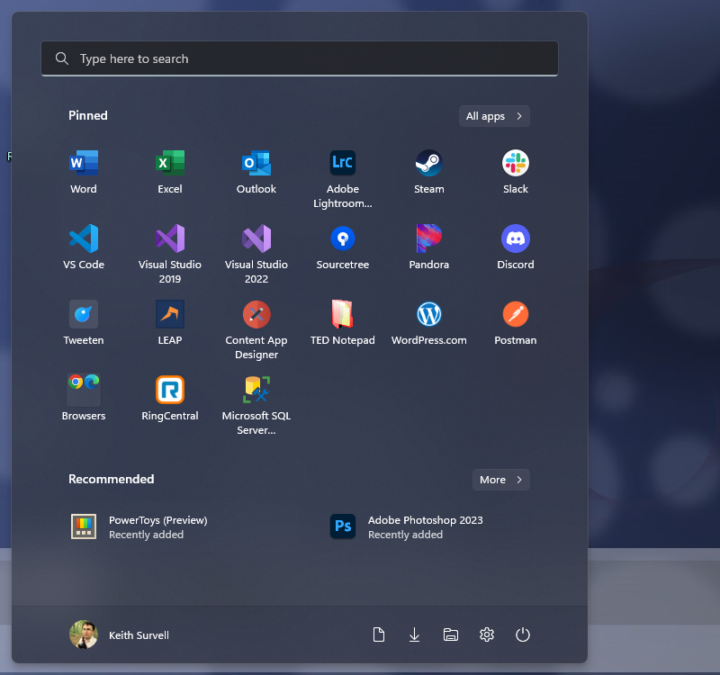
I understand that I’m a bit in the minority here, but in Windows 10 I had my Start menu laid out exactly as I needed – every program I regularly used (and there are a lot of them) was available with just 2 clicks: open Start menu, and click application icon.
Now, I had to resize the Start menu to cover more than half of my screen in order to do this, but it worked – I had them all grouped and organized nicely so that I could rely on muscle memory for finding the apps I needed often (and even some I used less often).
With Windows 11, that went completely away. The Start menu was a fixed size and it only room for 2 rows of 6 icons each – and that was it. Didn’t like it? Too bad.
Making things worse is that the early Search feature in Windows 11 wasn’t that great and could sometimes be rather slow – meaning that if you were trying to open an app you didn’t have pinned, you’d have to click the Start menu, type the name, and then potentially wait a few seconds for the Start menu search to figure itself out and show your results.
To add insult to injury, this wasn’t even the entire Start menu – a full half of the screen space taken up by the Start menu was dedicated to a “recommended” and “recent” section, which I did not like and do not use, so it was just wasted, empty screen real estate.
Now, thankfully you can shrink the size of this “recommended” section (though you can’t get rid of it alltogether, unfortunately) so I can have more icons on the screen at once, which has helped quite a bit. I would like it more if the Start menu could be resized like it could in Windows 10, or if that “recommended” section could just go away entirely, but this is definitely an improvement – especially when combined with the next item.
Start menu folders (sort of)
You can now drag multiple Start menu app icons on top of one another to create a “folder,” sort of – though it has much more in common with the app folders/groups that you can create on mobile devices. While this does let me create (and name) groups on my Start menu so it can hold more icons, it is not quite perfect.
For one thing, it adds an extra click when trying to get to an app, but more annoyingly, the animation for opening/expanding the folder is a little slow. It’s just slow enough to be annoying, but not so much that it is completely unusuable.
Tabbed File Explorer
This one will be a little controversial – not everyone is going to like it – but I absolutely love it.
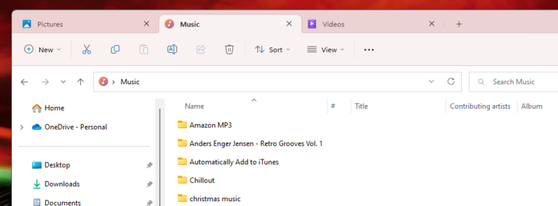
I frequently need to be looking at multiple folder locations at once, but I don’t like having multiple File Explorer windows open because it’s hard to tell at a glance on the taskbar which one is which. This is especially noticable now that Windows 11 has removed the option for larger app buttons – I always used to have the larger buttons with the window title showing so I could tell which one is which.
Prior to the 22H2 release, I simply had to open up File Explorer windows and look at the address bar to see what it was showing me. But now I can open up separate tabs, so I can have all these locations open at once.
File Explorer Folder Previews
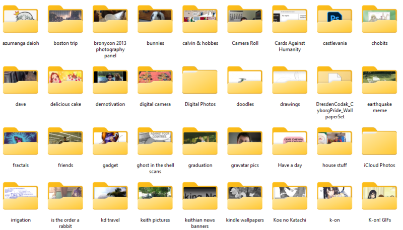
In prior Windows versions, if you had the icon size in File Explorer set large enough, you could see a sort-of preview of some kinds of files in subfolders – the most common one being image folders, where you’d see perhaps 4 tiny thumbnail preview images on the yellow folder icon to give you a hint of what was in that folder.
Windows 11 did away with that, leaving me with nothing but a sea of yellow folders. But the 22H2 release has brought some of that back, with folder content previews.
Not a huge deal, but a welcome improvement.
Snap layouts
This is another one that falls into the “not a huge deal, but a welcome improvement” category, at least for me. I normally leave most application windows maximized, relying on my 2 monitors to separate things – but not everyone is like me, and even I sometimes need to have windows be side-by-side on the same monitor.
Snap layouts helps with this, giving you the ability to pick from a couple of common window layouts, which is a very welcome feature.
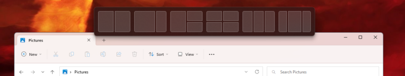
Sure, you could have dragged windows to either the left or right of a screen to make them do the side-by-side thing, but that was your only option. Snap layouts gives you more options, which is especially welcome for people who have a single, very wide monitor.
“Open With” dialog interface improvements
The old “Open With” dialog that appeared when you clicked a file with an unknown app association was always a bit wonky, in my opinion, even in Windows 10.
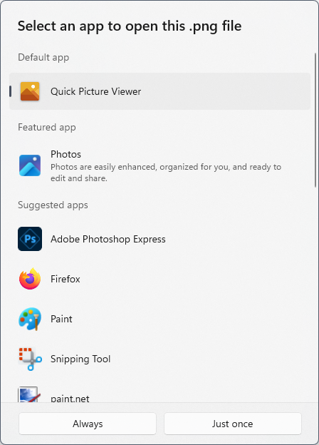
Now, however, you’ve got a nice, clean interface for choosing an app – and it is clear which one is the default (if there already is one), and it’s easy to make the choice of just using an app just this once or making it the default.
More Visual Updates to Windows 11 style (task manager, settings, etc.)
Of course, every update to Windows 11 seems to be updating some other obscure component that was still stuck in an older UI design, but it is still nice to see the OS becoming more of a coherent whole.
Volume overlay
I was never very fond of the old volume overlay – it got in the way too often for my taste. The new volume overlay is a bit too easy to loose sight of, especially on a busy screen, but I still think it’s better, both in terms of size and position, so I’m thankful for this (admittedly small) change.
Terminal
This last one isn’t so much a new thing for 22H2 – it’s actually been in Windows 11 for a while now – but it is now the default, and I’m glad to see that. The new Terminal app is a welcome upgrade over the old command prompt or even just the plain Powershell window. And it has tabs!
Overall, I’m very happy with the changes in Windows 11 22H2, both in terms of what was done and the direction changes are going. Hopefully the updates continue in this way and Windows 11 continues to get better and better!